60.Plotting and Visualization-Matplotlib
Matplotlib is one of the most popular Python packages used for data visualization. It is a cross-platform library for making 2D plots from data in arrays.Matplotlib is written in Python and makes use of NumPy.It was introduced by John Hunter in the year 2002.
One of the greatest benefits of visualization is that it allows us visual access to huge amounts of data in easily digestible visuals. Matplotlib consists of several plots like line, bar, scatter, histogram etc.
Anaconda is a free and open source distribution of the Python and R programming languages for large-scale data processing, predictive analytics, and scientific computing. The distribution makes package management and deployment simple and easy. Matplotlib and lots of other useful (data) science tools form part of the distribution.If you have anaconda installed on your computer matplotlib can be used directly else install matplotlib.
Lets plot a simple sin wave using matplotlib
1.To begin with, the Pyplot module from Matplotlib package is imported
import matplotlib.pyplot as plt2.Next we need an array of numbers to plot.
import numpy as npimport math
x = np.arange(0, math.pi*2, 0.05)
4.The values from two arrays are plotted using the plot() function.
x = np.arange(0, math.pi*2, 0.05)
3.The ndarray object serves as values on x axis of the graph. The corresponding sine values of angles in x to be displayed on y axis are obtained by the following statement
y = np.sin(x)4.The values from two arrays are plotted using the plot() function.
plt.plot(x,y)
5.You can set the plot title, and labels for x and y axes.You can set the plot title, and labels for x and y axes.
plt.xlabel("angle")
plt.ylabel("sine")
plt.title('sine wave')
6.The Plot viewer window is invoked by the show() function plt.show()
The complete program is as follows −
from matplotlib import pyplot as plt
import numpy as np
import math #needed for definition of pi
x = np.arange(0, math.pi*2, 0.05)
y = np.sin(x)
plt.plot(x,y)
plt.xlabel("angle")
plt.ylabel("sine")
plt.title('sine wave')
plt.show()

Anatomy of a figure ( ref: matplotlib.org)

Matplotlib - PyLab module
PyLab is a procedural interface to the Matplotlib object-oriented plotting library. Matplotlib is the whole package; matplotlib.pyplot is a module in Matplotlib; and PyLab is a module that gets installed alongside Matplotlib.
PyLab is a convenience module that bulk imports matplotlib.pyplot (for plotting) and NumPy (for Mathematics and working with arrays) in a single name space. Although many examples use PyLab, it is no longer recommended.
using pylab
import numpy as np
from pylab import *
x = np.linspace(-3, 3, 30)
y = x**2
plot(x, y)
show()
from pylab import *
x = np.linspace(-3, 3, 30)
y = x**2
plot(x, y)
show()
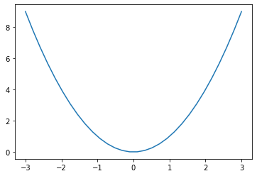
basic plot using matplotlib.pyplot
import numpy as np
import matplotlib.pyplot as plt
x = np.linspace(-3, 3, 30)
y = x**2
plt.plot(x, y)
plt.show()
import matplotlib.pyplot as plt
x = np.linspace(-3, 3, 30)
y = x**2
plt.plot(x, y)
plt.show()
import numpy as np
import matplotlib.pyplot as plt
x = np.linspace(-3, 3, 30)
y = x**2
plt.plot(x, y,'r.')
plt.show()
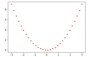
import matplotlib.pyplot as plt
x = np.linspace(-3, 3, 30)
y = x**2
plt.plot(x, y,'r.')
plt.show()

import numpy as np
import matplotlib.pyplot as plt
from pylab import *
x = np.arange(0, math.pi*2, 0.05)
plt.plot(x, sin(x))
plt.plot(x, cos(x), 'r-')
plt.plot(x, -sin(x), 'g--')
import matplotlib.pyplot as plt
from pylab import *
x = np.arange(0, math.pi*2, 0.05)
plt.plot(x, sin(x))
plt.plot(x, cos(x), 'r-')
plt.plot(x, -sin(x), 'g--')
plt.show()

Color codes
Marker codes
Line styles
| Character | Color |
|---|---|
| ‘b’ | Blue |
| ‘g’ | Green |
| ‘r’ | Red |
| ‘c’ | Cyan |
| ‘m’ | Magenta |
| ‘y’ | Yellow |
| ‘k’ | Black |
| ‘w’ | White |
| Character | Description |
|---|---|
| ‘.’ | Point marker |
| ‘o’ | Circle marker |
| ‘x’ | X marker |
| ‘D’ | Diamond marker |
| ‘H’ | Hexagon marker |
| ‘s’ | Square marker |
| ‘+’ | Plus marker |
| Character | Description |
|---|---|
| ‘-‘ | Solid line |
| ‘—‘ | Dashed line |
| ‘-.’ | Dash-dot line |
| ‘:’ | Dotted line |
| ‘H’ | Hexagon marker |
Adding Grids and Legend to the Plot
import numpy as npimport matplotlib.pyplot as plt
import math
x = np.arange(0, math.pi*2, 0.05)
plt.plot(x, np.sin(x),label='sin')
plt.plot(x, np.cos(x), 'r-',label='cos')
plt.plot(x, -np.sin(x), 'g--',label='-sin')
plt.grid(True)
plt.title('waves')
plt.xlabel('x')
plt.ylabel('sin cos -sin')
plt.legend(loc='upper right')
plt.show()
import matplotlib.pyplot as plt
x = np.arange(0, math.pi*2, 0.05)
plt.plot(x, np.sin(x),label='sin')
plt.plot(x, np.cos(x), 'r-',label='cos')
plt.plot(x, -np.sin(x), 'g--',label='-sin')
plt.grid(True)
plt.title('waves')
plt.xlabel('x')
plt.ylabel('sin cos -sin')
plt.legend(loc='upper right')
plt.show()

The following code will create three separate figures and plot
import numpy as npimport matplotlib.pyplot as plt
import math
x = np.arange(0, math.pi*2, 0.05)
plt.figure(1)
plt.plot(x, np.sin(x),label='sin')
plt.xlabel('x')
plt.ylabel('sin')
plt.legend(loc='upper right')
plt.grid(True)
plt.figure(2)
plt.plot(x, np.cos(x), 'r-',label='cos')
plt.xlabel('x')
plt.ylabel('cos')
plt.legend(loc='upper right')
plt.grid(True)
plt.figure(3)
plt.xlabel('x')
plt.ylabel('-sin')
plt.plot(x, -np.sin(x), 'g--',label='-sin')
plt.legend(loc='upper right')
plt.grid(True)
plt.show()


x = [5, 2, 9, 4, 7]
y = [10, 5, 8, 4, 2]
# Function to plot the bar
plt.bar(x,y)
# function to show the plot
plt.show()


Scatter Plot


import matplotlib.pyplot as plt


x = np.arange(0, math.pi*2, 0.05)
plt.figure(1)
plt.plot(x, np.sin(x),label='sin')
plt.xlabel('x')
plt.ylabel('sin')
plt.legend(loc='upper right')
plt.grid(True)
plt.figure(2)
plt.plot(x, np.cos(x), 'r-',label='cos')
plt.xlabel('x')
plt.ylabel('cos')
plt.legend(loc='upper right')
plt.grid(True)
plt.figure(3)
plt.xlabel('x')
plt.ylabel('-sin')
plt.plot(x, -np.sin(x), 'g--',label='-sin')
plt.legend(loc='upper right')
plt.grid(True)
plt.show()


Plot the functions tan x and cot x vs x on the same plot with x going from −2π to 2π. Make sure the limits of the x-axis do not extend beyond the limits of the data. Plot tan x in red color and cot x in blue color and include a legend to label the two curves. Place the legend within the plot at the lower right corner. Draw thin gray lines behind the curves, one horizontal at y = 0 and the other vertical at x = 0.(university question)
import matplotlib.pyplot as plt
import numpy as np
x = np.arange(-2*np.pi,2*np.pi,0.1)
y = np.tan(x)
z = 1/np.tan(x)
plt.plot(x,y,'r')
plt.plot(x,z,'b')
plt.ylim(-3,3)
plt.xlabel('x values from -2pi to 2pi')
plt.ylabel('tan(x) and cot(x)')
plt.title('Plot of tan and cot from -2pi to 2pi')
plt.legend(['tan(x)', 'cot(x)'],loc='lower right')
plt.axhline(y=0, color='gray',linewidth=0.25)
plt.axvline(x=0, color='gray',linewidth=0.25)
plt.show()

Creating a bar plot
from matplotlib import pyplot as plt x = [5, 2, 9, 4, 7]
y = [10, 5, 8, 4, 2]
# Function to plot the bar
plt.bar(x,y)
# function to show the plot
plt.show()

import matplotlib.pyplot as plt
x = [5, 2, 9, 4, 7]
y = [10, 5, 8, 4, 2]
# Function to plot the bar
plt.barh(x,y)
# function to show the plot
plt.show()

Creating a histogram
from matplotlib import pyplot as plt
# x-axis values
x = [5, 2, 9, 4, 7,5,5,5,4,9,9,9,9,9,9,9,9,9]
# Function to plot the histogram
plt.hist(x)
# function to show the plot
plt.show()

from matplotlib import pyplot as plt
x = [5, 2, 9, 4, 7]
y = [10, 5, 8, 4, 2]
# Function to plot scatter
plt.scatter(x, y)
plt.show()

Stem plot
from matplotlib import pyplot as plt
x = [5, 2, 9, 4, 7]
y = [10, 5, 8, 4, 2]
# Function to plot scatter
plt.stem(x, y,use_line_collection=True)
plt.show()

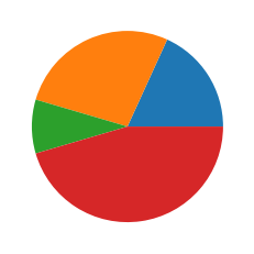
Pie Plot
import matplotlib.pyplot as plt
data=[20,30,10,50]
plt.pie(data)
plt.show()
Subplots with in the same plot
import numpy as npimport matplotlib.pyplot as plt
from numpy import sin,cos,tan
x = np.arange(0, math.pi*2, 0.05)
plt.subplot(2,2,1)
plt.plot(x, sin(x),label='sin')
plt.xlabel('x')
plt.ylabel('sin')
plt.legend(loc='upper right')
plt.grid(True)
plt.subplot(2,2,2)
plt.plot(x, cos(x), 'r-',label='cos')
plt.xlabel('x')
plt.ylabel('cos')
plt.legend(loc='upper right')
plt.grid(True)
plt.subplot(2,2,3)
plt.xlabel('x')
plt.ylabel('-sin')
plt.plot(x, -sin(x), 'g--',label='-sin')
plt.legend(loc='upper right')
plt.grid(True)
plt.subplot(2,2,4)
plt.xlabel('x')
plt.ylabel('tan')
plt.plot(x, tan(x), 'y-',label='tan')
plt.legend(loc='upper right')
plt.grid(True)
plt.show()
import numpy as np
fig = plt.figure()
ax1 = fig.add_subplot(221)
ax2 = fig.add_subplot(222)
ax3 = fig.add_subplot(223)
ax4 = fig.add_subplot(224)
x = np.linspace(0, np.pi)
y2 = -x * 2
y_sin = np.sin(x)
y_cos = np.cos(x)
z = x ** 2 + x
ax1.plot(x, y_cos)
x = np.arange(0, math.pi*2, 0.05)
plt.subplot(2,2,1)
plt.plot(x, sin(x),label='sin')
plt.xlabel('x')
plt.ylabel('sin')
plt.legend(loc='upper right')
plt.grid(True)
plt.subplot(2,2,2)
plt.plot(x, cos(x), 'r-',label='cos')
plt.xlabel('x')
plt.ylabel('cos')
plt.legend(loc='upper right')
plt.grid(True)
plt.subplot(2,2,3)
plt.xlabel('x')
plt.ylabel('-sin')
plt.plot(x, -sin(x), 'g--',label='-sin')
plt.legend(loc='upper right')
plt.grid(True)
plt.subplot(2,2,4)
plt.xlabel('x')
plt.ylabel('tan')
plt.plot(x, tan(x), 'y-',label='tan')
plt.legend(loc='upper right')
plt.grid(True)
plt.show()

alternate method of creating subplots within the same plot
import matplotlib.pyplot as pltimport numpy as np
fig = plt.figure()
ax1 = fig.add_subplot(221)
ax2 = fig.add_subplot(222)
ax3 = fig.add_subplot(223)
ax4 = fig.add_subplot(224)
x = np.linspace(0, np.pi)
y2 = -x * 2
y_sin = np.sin(x)
y_cos = np.cos(x)
z = x ** 2 + x
ax1.plot(x, y_cos)
ax2.plot(x, z, 'co-', linewidth = 1, markersize = 2)
ax3.plot(x, y_sin, color = 'blue', marker = '+', linestyle = 'dashed')
ax4.plot(x, y2, 'm-.', markersize = 2)
plt.show()
ax3.plot(x, y_sin, color = 'blue', marker = '+', linestyle = 'dashed')
ax4.plot(x, y2, 'm-.', markersize = 2)
plt.show()

Ticks in Plot
Ticks are the values used to show specific points on the coordinate axis. It can be a number or a string. Whenever we plot a graph, the axes adjust and take the default ticks. Matplotlib’s default ticks are generally sufficient in common situations but are in no way optimal for every plot. Here, we will see how to customize these ticks as per our need.
The following program shows the default ticks and customized ticks
import matplotlib.pyplot as plt
import numpy as np
# values of x and y axes
x = [5, 10, 15, 20, 25, 30, 35, 40, 45, 50]
y = [1, 4, 3, 2, 7, 6, 9, 8, 10, 5]
figure(1)
plt.plot(x, y, 'b')
plt.xlabel('x')
plt.ylabel('y')
figure(2)
plt.plot(x, y, 'r')
plt.xlabel('x')
plt.ylabel('y')
# 0 is the initial value, 51 is the final value
# (last value is not taken) and 5 is the difference
# of values between two consecutive ticks
plt.xticks(np.arange(0, 51, 5))
plt.yticks(np.arange(0, 11, 1))
plt.tick_params(axis='y',colors='red',rotation=45)
plt.show()

| PARAMETER | VALUE | USE |
|---|---|---|
| axis | x, y, both | Tells which axis to operate |
| reset | True, False | If True, set all parameters to default |
| direction | in, out, inout | Puts the ticks inside or outside or both |
| length | Float | Sets tick’s length |
| width | Float | Sets tick’s width |
| rotation | Float | Rotates ticks wrt the axis |
| colors | Color | Changes tick color |
| pad | Float | Distance in points between tick and label |
Create a matplotlib plot with two lines representing the functions y=sin(x) x varies from 0 to 2pi (using solid line) and y=cos(x) (using dashed lines).Customize the plot by adding appropriate ticks, labels for the x and y axis, and a legend to distinguish between the two functions.( University Questions)
import numpy as np
import matplotlib.pyplot as plt
# Generate x values from 0 to 2π
x = np.linspace(0, 2 * np.pi, 100)
# Calculate y values
y_sin = np.sin(x)
y_cos = np.cos(x)
# Create the plot
plt.plot(x, y_sin, label='sin(x)', linestyle='-') # Solid line
plt.plot(x, y_cos, label='cos(x)', linestyle='--') # Dashed line
# Add labels and title
plt.xlabel('x (radians)')
plt.ylabel('y value')
plt.title('Plot of sin(x) and cos(x)')
# Customize ticks
plt.xticks([0, np.pi/2, np.pi, 3*np.pi/2, 2*np.pi],
['0', 'π/2', 'π', '3π/2', '2π'])
plt.yticks([-1, -0.5, 0, 0.5, 1])
# Add legend
plt.legend()
# Display the plot
plt.grid(True)
plt.show()


Comments
Post a Comment